Making data fun: Launching a personalised year-end review to keep users engaged and entertained
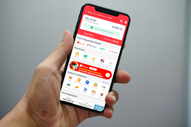
To show users the actual value they get from using ShopBack, we created a personalised, year-end review feature similar to Spotify Wrapped. The campaign launched across multiple countries, showing users their unique shopping habits and total savings from the past year.
The Brief
Change boring transaction data into a fun, shareable, viral-worthy story that shows personal value, teaches users about different ways to earn, and keeps them coming back to the app.
My Role: Lead UX Writer. I worked alongside Product Designers, Data Analysts, and Engineers to build and translate these flows for multiple global markets.
The Core Metrics: Feature session duration, generate shareability (viral loop), and educate users on ShopBack’s earning ecosystems.
A feature where no user gets left behind…
Before we even began development, we had some technical and business constraints that shaped the feature:
The eligible vs ineligible split: We couldn't show personalised stats to everyone, as not all users had enough shopping history. Data dictated a hard split. So, we created two categories:
Eligible users: Those who shopped at more than one store and met a minimum earnings, like $20 SGD, got a highly personalised data story.
Ineligible users: Those who fell below the above threshold got a generic, community-focused story designed to show them what they could earn in the future.
Handling multiple languages: Text strings had to change automatically to show the right local currency (SGD, MYR, IDR, PHP, VND, AUD, TWD, HKD, KRW, EUR) and the top local stores based on the user’s location. So, we had to ensure that any story accounted for how certain languages might impact the end design.
Finding out what works best
Together with the main product designer, we first looked at how products like Spotify, Duolingo, and Google structure their year-end lookbacks, learning a few clear lessons about copy and design:
Keep it short: The best features use only 1–2 short sentences per screen. This lets animations build excitement without making the text hard to read.
One thought per screen: Putting too many stats on one screen overwhelms users. We gave major insights—like top stores or earning methods—their own dedicated cards.
Design for quick scanning: Because users tap through quickly, we put the biggest win or number at the very top or central in a large font size, using the bottom text just for quick context, to praise users, or a light joke.
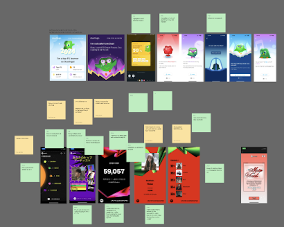

Developing the story and battling data overload
Our Product Managers initially had a long list of data points they were adamant about keeping in the flow, wanting to showcase every single metric the backend could track.
To find a middle ground, we went through a rigorous drafting and sketching phase, trying to balance between business desires and actual user experience:
Content-first wireframing: Before design, I mapped out the story using simple text boxes. This allowed us to focus on the story flow, seeing where text felt natural and where data started to feel overwhelming.
Navigating the data push: Seeing the copy isolated made it clear that cramming every metric onto the screen ruined the story. By visualising the layout early, I showed the PMs how we could logically combine some data points and cut others to save on pacing.
Co-designing animation: Once we finalised the text placement, I worked closely with the designer on the animations so that the text and visual elements would appear harmoniously, ensuring the animations highlighted the copy rather than distracting from it.

Phase & screens
Step 1: The big wins
(Screens 1–5)
Step 2: Exploring the app
(Screens 6–11)
Approaching each screen section
What the user sees
The experience opens automatically when the user opens the app.
The user clicks through their store history.
Step 3: Fun personas
(Screens 12–13)
The user sees their shopping personality.
Step 4: Sharing
(Screens 14)
The final summary card and finish screen.
The writing goal
Hook the user immediately with their biggest successes.
Teach users that the app works for more than just online shopping.
Make the user smile, creating a viral-ready moment and getting them excited to share their results.
Transition the user to sharing online.
The solution & rationale
We dedicated whole screens to massive text displaying single, high-value stats ($204 saved, 200 active days, etc.). This gives instant satisfaction.
We changed the focus from pure savings to show the different ways they earned (Online, In-Store, Gift Cards) and highlighted their favourite brands like Shopee or Booking.com.
Give users a fun persona based on their data (like "Flavour Chaser"), making them much more likely to share it online with friends.
We ended with a clean summary card made for social media sharing.
Step 1: The big wins

Step 2: Exploring the app

Step 3: Fun personas

Step 4: sharing

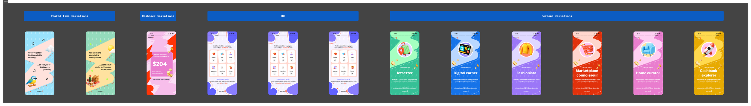
Content variations of main flow
Did “Your Cashback Wins,” win?
Our final metrics proved that personal data kept users highly engaged:
Massive final reach:
Putting an automatic pop-up when the app opened worked well. Final reach hit 60–70% in markets compared to just 20–25% in markets without the pop-up. Only 13% of users closed it immediately.Strong Engagement from Earners:
Active shoppers spent an average of 1 minute 30 seconds in the feature. 40% viewed all 16 screens, and completion hit ~50% in Germany (DE), Singapore (SG), and Hong Kong (HK)Encouraging Signals from Non-Earners:
Users with low activity still spent an average of ~1 minute inside the feature, with a solid 30% making it to the very end.