Europe? It’s Bikable
The problem
Europe is one of the best places in the world for cycling. But for cycle companies, it’s a crowded market. This was the problem Denmark’s leading cycle e-commerce company, CykelGear, faced when expanding into neighbouring countries. Cykelgear had the production, the people and the love for cycling but needed a new identity to stand out.
Our solution
I conducted extensive competitor research before we discovered Cykelgear’s core mission, vision and values. Through our detailed brand profile and market analysis, we uncovered Cykelgear’s true point of difference: that Cykelgear equally serves every type of cyclist.
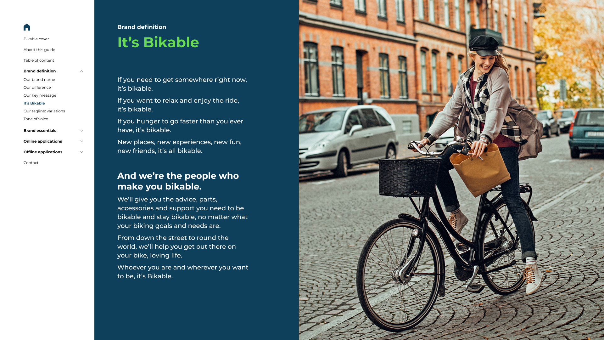
From our insight, we coined the name: Bikable, a can-do brand that enables all cyclists. This name inspired the brand’s attitude with taglines that call you to join in: It’s Bikable, I’m Bikable, We’re Bikable.
With the name and tone set, we developed the remaining brand elements. From a new e-commerce site to an entire merchandise line, Bikable now had all the gear for success.
Bikable Branding Video
Brand definition
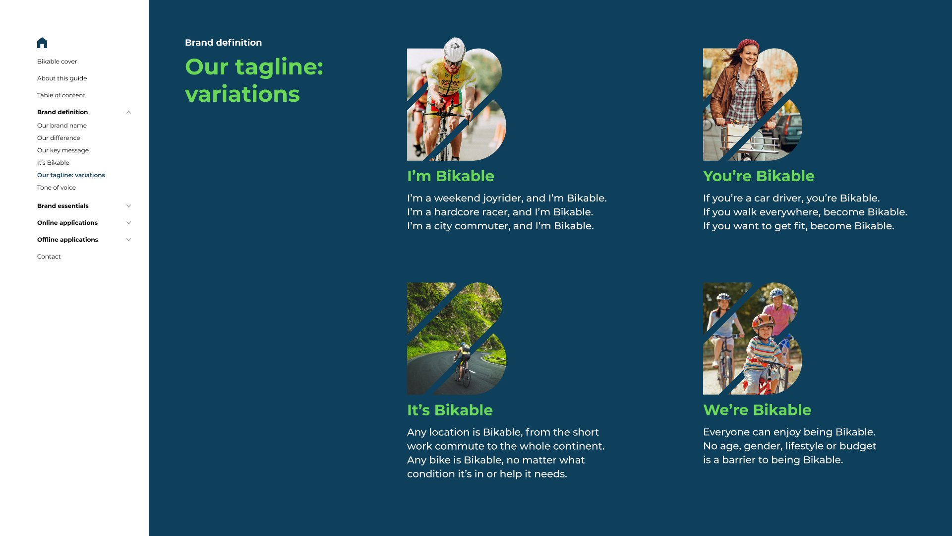
Taglines
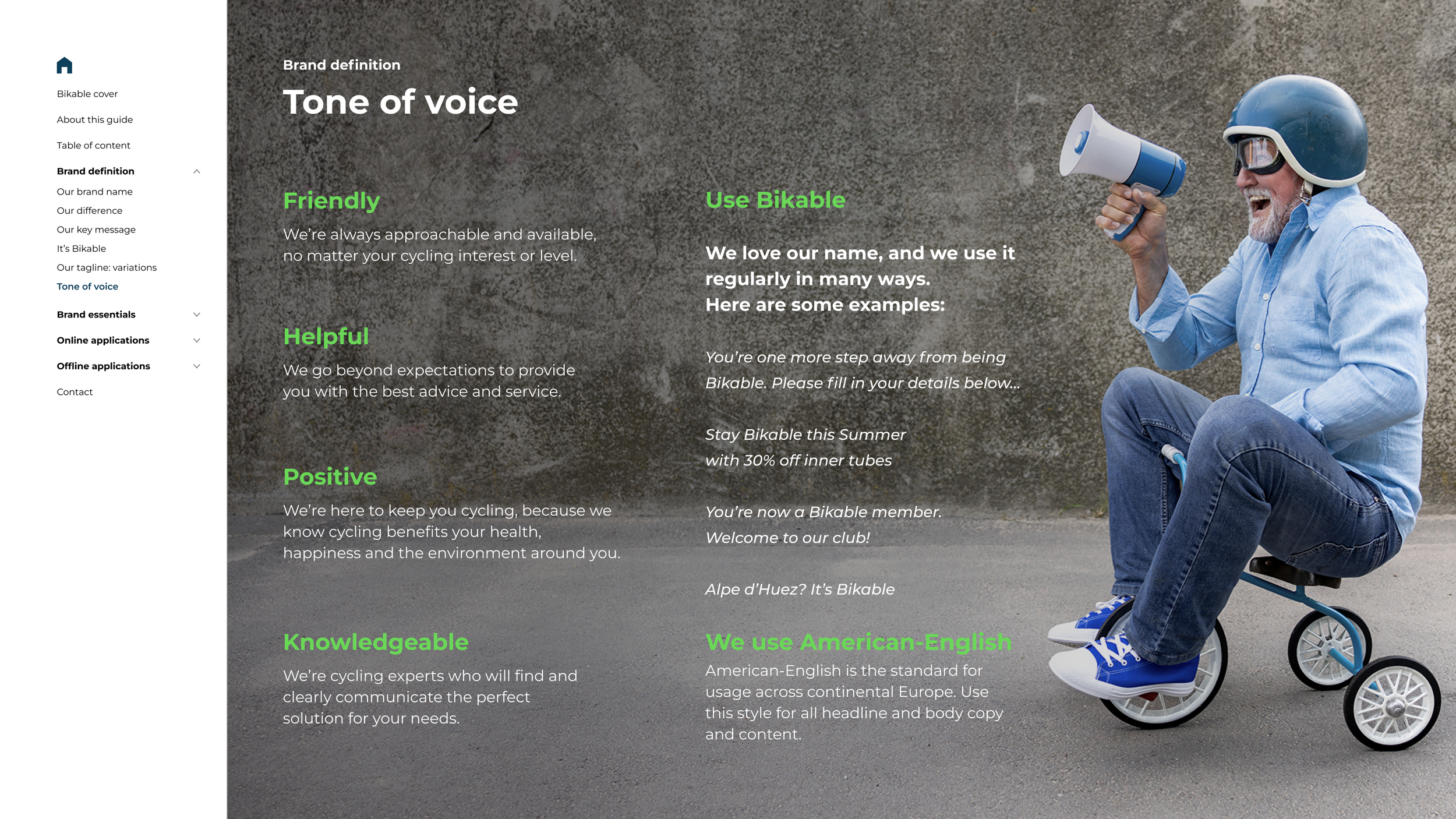
Tone of Voice
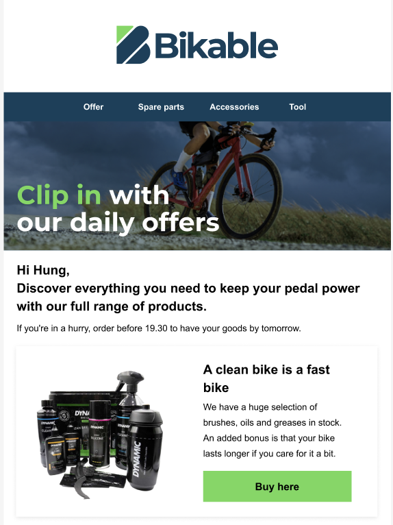
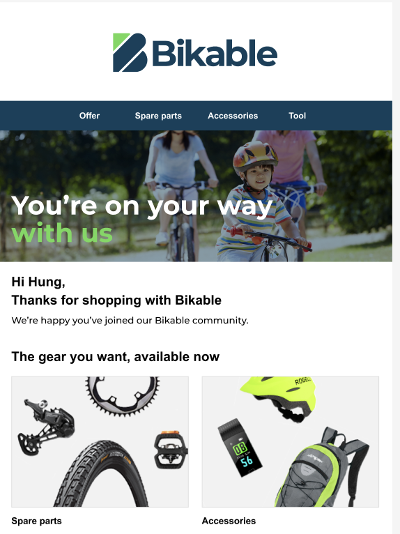
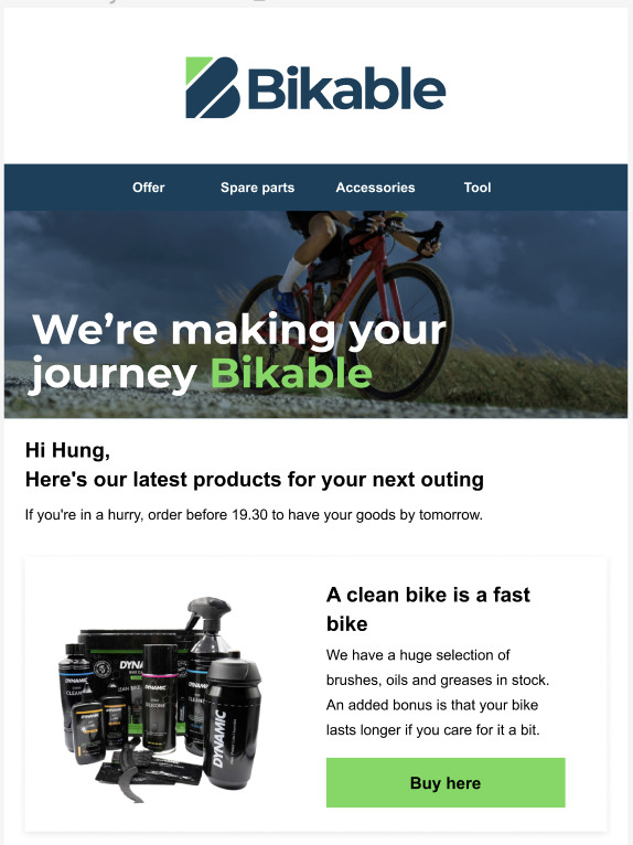
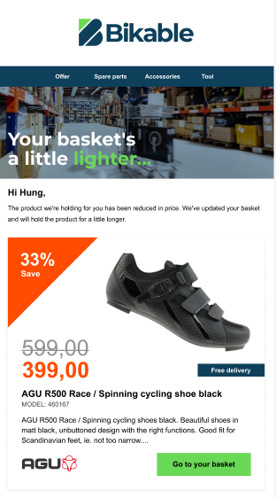
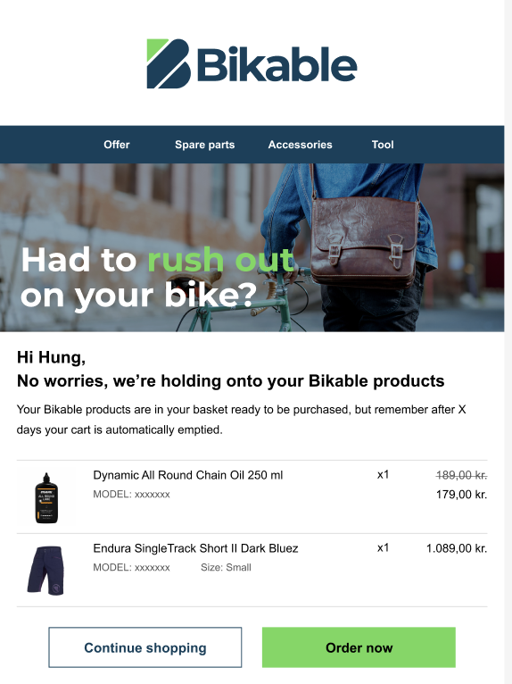
Email marketing
With fun, cycle-focused messaging, we boosted click-through rates and drove traffic to Bikable’s website, enhancing user engagement.
-
![]()
Daily offers
-
![]()
Post purchase
-
![]()
Weekly newsletter
-
![]()
Price drop
-
![]()
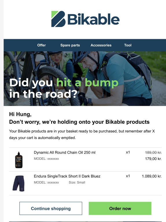
Soft abandon
-
![]()
Standard abandon
-
![]()
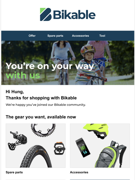
1st purchase
-
![]()
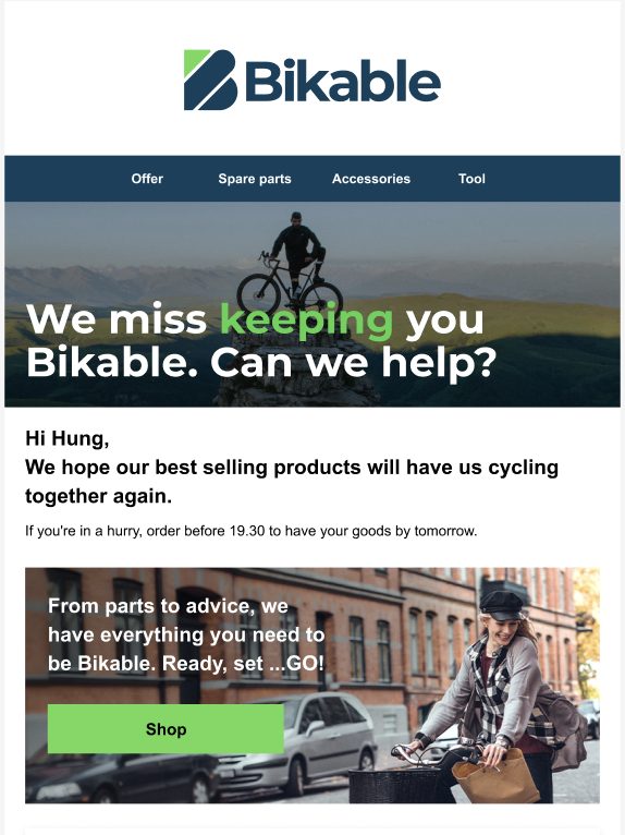
Win back customers
-
![]()
Unengaged customers

Banners
Our pictures interplay with our messaging, highlighting the joy of cycling, regardless of level… or weather. This enables Bikable to connect with all customers, from semi-pros to city spinners.


Company: The Color Club
Creative Director: Martin Sutcliffe
Creative Lead: Tho Tran Hoang
Creative Designer: Tam Vo
Creative Designer: Thanh Nguyen Vu
Creative Designer: Ngan Ngo