Fixing the "Shop by Image" funnel: How clear copy dropped upload errors
ShopBack has a "Shop by Image" feature that lets users upload a photo of a clothing item or home product to find similar deals and earn cashback.
The problem
Users were uploading completely wrong images—like grocery receipts or random household items. Because the tool only recognises fashion and home decor, our system couldn't read these files, resulting in massive upload failures and high error rates.
The Goal: Change the onboarding text to clearly explain what items the tool actually supports, filtering out invalid uploads before they happen.
My Role: UX Writer, updating the onboarding copy based on user data and error trends.

The redesign: From generic to explicit
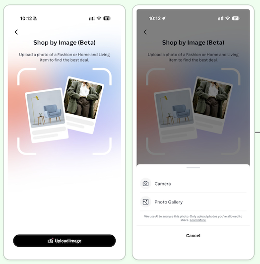
The initial screens were too vague, and the content placement made it easy to overlook. That led users to believe they could upload any photo to find a deal.
Old Text: The headline read "Shop by Image (Beta)" with a generic button that simply said "Upload Image."
The Copy Change: We updated the entire onboarding screen to layout a simple 1-2-3 step process. Crucially, we changed the main action button from "Upload Image" to "Upload Home or Fashion Item." We also added a clear note directly above the button stating: "Note: Home and fashion items only, for now."
Why it works: By bolding the copy in a listicle way and putting the rules right on the button, users are drawn to the content and have to read the restrictions at the exact moment they decide to click.
Data results and impact
Following the onboarding changes above, we saw an immediate change in use behaviour:
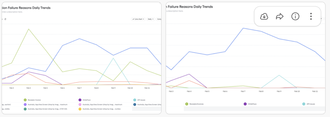
Better match rates: The percentage of image uploads that successfully led to a results screen jumped from 40% to 50% in Singapore (SG), and from 28.4% to 37.6% in Australia (AU).
Drop in errors: Errors caused by users uploading receipts or non-supported items dropped drastically within the first 48 hours of launching the new text.
The trade-off: We did notice a slight dip in total uploads. However, this actually proved the copy worked. Users who realised their receipts wouldn't work decided to leave the screen rather than upload a poor photo and trigger an error message.
What we learned
This quick project proved that preventative content design works. Instead of letting a user make a mistake and showing them an error message afterwards, changing a simple button label and redesigning content stopped the mistake from happening in the first place, saving server resources and reducing user frustration.